AllWell Medical App
Simplifying doctor visits and appointment scheduling for clinic patients.
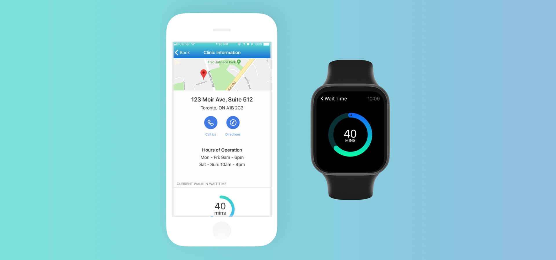
Overview
AllWell Medical is a conceptual iOS/watchOS app that aims to help patients plan their doctor visits quickly and seamlessly. Users can complete patient registrations, book and manage their doctor appointments, view clinic walk-in status, and get timely updates or reminders with just a few taps on their phone or smartwatch.
My Role
- Interaction Design
- Sketches
- Prototyping
- User Testing
- Visual Design
Timeline
- 3 weeks
Tools
- Figma
- Balsamiq
Team
- Elana Chapman
- Justina Lam
- Claudia Szabuniewicz
- Amelia Tan
Problem
Administrative staff at medical centers spend hours tending to patients' needs every day. They handle phone requests for appointments from off-site patients and respond to their inquiries, all while attending to patients on-site at the clinic. This inevitably leads to communication inefficiencies, longer wait times, and an overall frustrating experience for both patients and staff.
How might we offload some of the time-consuming admin tasks performed for off-site patients to better focus on on-site patient care?
Goals
Our goal was to support clinics in meeting the needs of their off-site patients by designing a mobile app (and a companion watch app) that provides users with greater flexibility and autonomy in planning their doctor visits.
Process
With three weeks to design an entire app, we took a Lean UX approach from the outset. We built a minimum viable product (MVP) initially based on our assumptions and then iterated as necessary based on continuous user feedback.
💡
Think
- Business Outcomes
- User Outcomes
- Proto-Persona
- Feature Prioritization
🖌
Make
- User Flows
- Low Fidelity
- Mid Fidelity
- High Fidelity
🔍
Check
- Guerrilla Testing
- Usability Testing
Generating assumptions
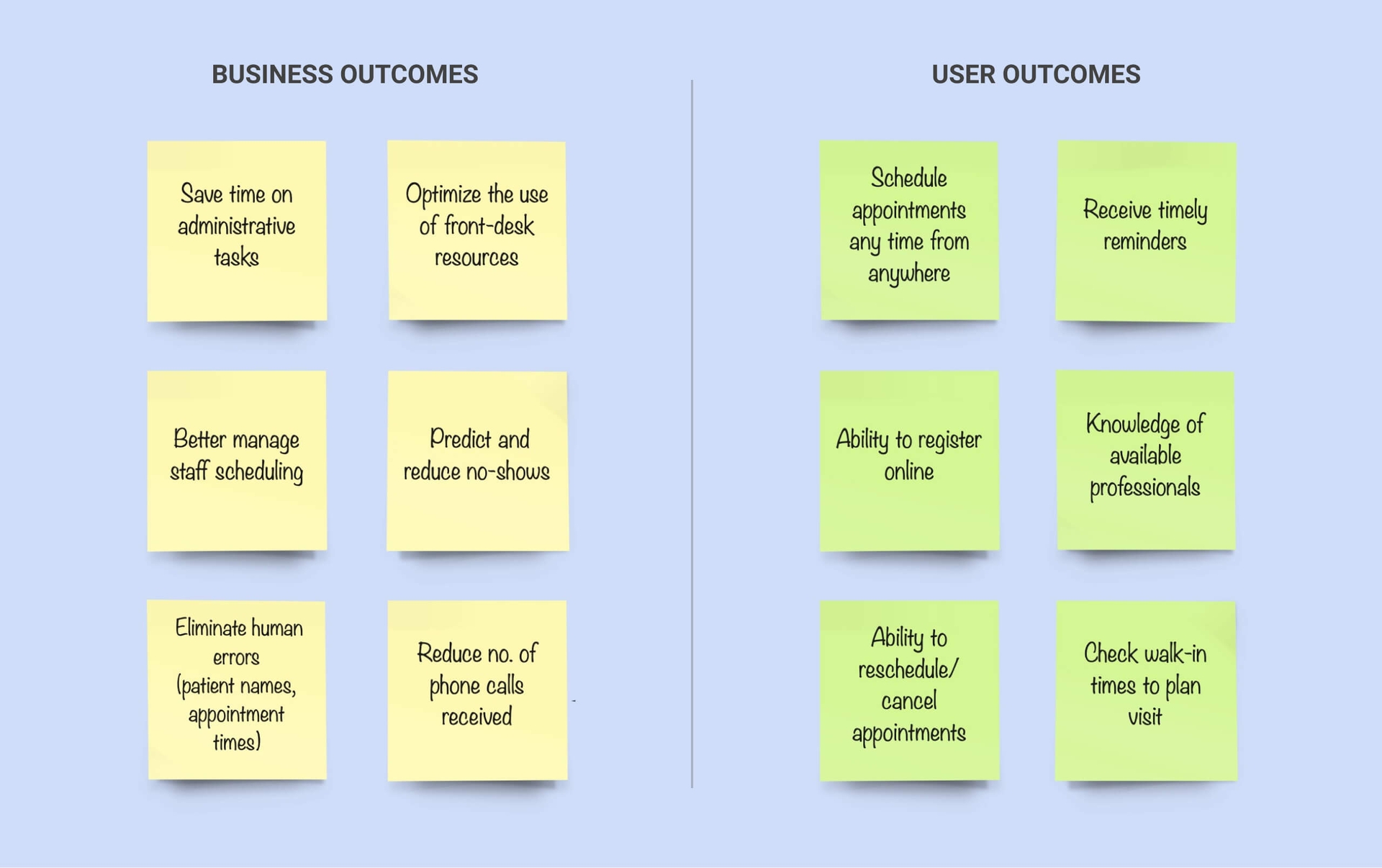
We started with a brainstorming session where we defined the problem statement and generated assumptions about the business outcomes and user benefits we are trying to achieve. Our target users were patients who were eager to use digital tools to plan their doctor visits.
Creating a proto-persona
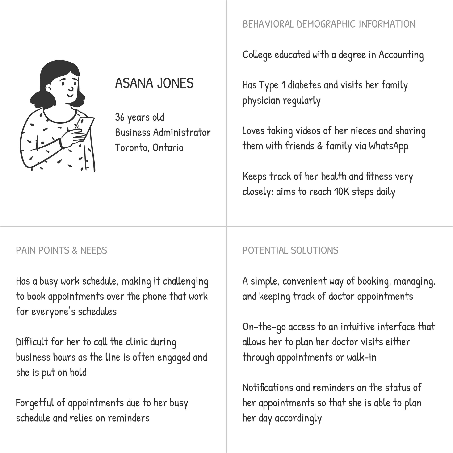
To capture our assumptions about our target users, we developed a proto-persona: Asana, a woman in her mid-30s who visits her family physician regularly. Asana kept us focused on user needs as we validated and iterated on our designs.
Prioritizing features for the MVP
Once we had a good idea of the context in which patients like Asana would use our app, we then brainstormed features that would help them achieve their expected outcomes.
We shortlisted the following features for the MVP based on what we assumed to be most relevant to off-site patients:
- New Patient Registration
- Appointment Scheduling and Management
- Appointment Reminders
- Doctor Information
- Walk-In Clinic Information
Rapidly sketching wireframes for the app
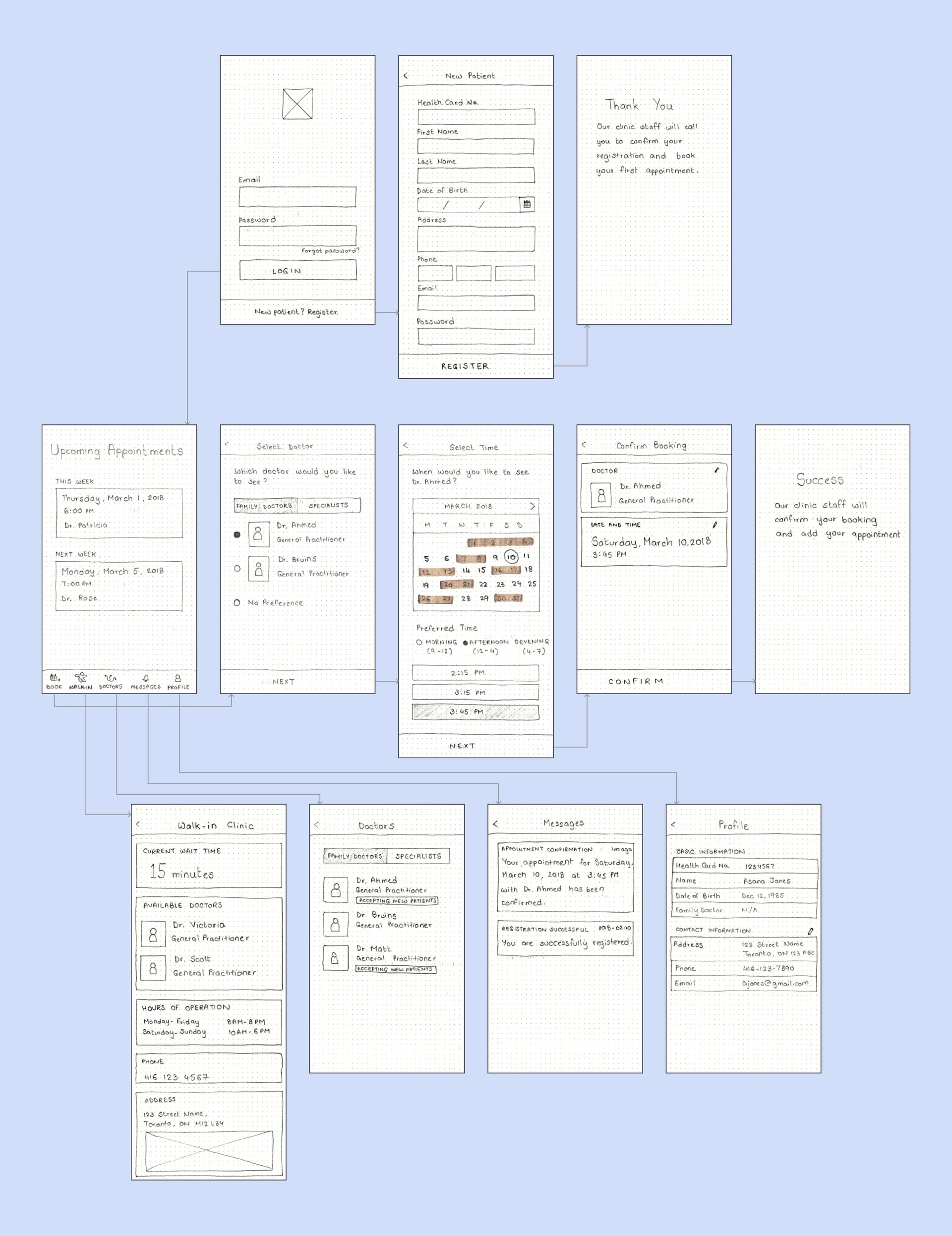
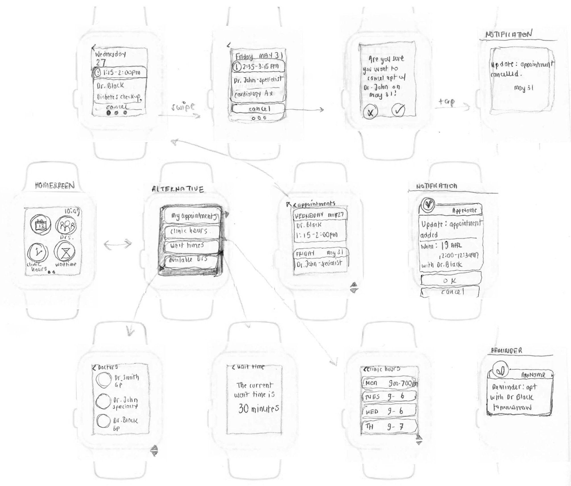
We ran a collaborative design studio where each team member rapidly sketched their own ideas for the selected features on a 6-up sheet. After a few rounds of divergent ideation, we voted for the best ideas and converged on one final set of sketches each for the mobile app and the smartwatch app.
Getting feedback early and often
We created a low-fidelity paper prototype using the sketches and showed them to five people who had experience setting doctor appointments. The goal was to quickly validate the features of the app and to check whether specific functionality worked in the way it was supposed to. We made iterations on the designs based on user feedback and moved on to the next stage.
Example of iteration:
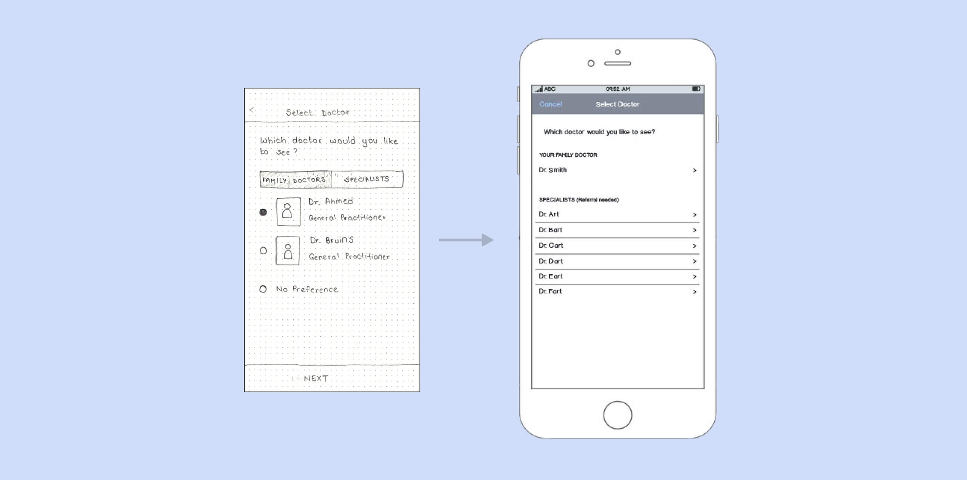
Pain Point: Users were confused with the option to choose a family doctor when booking an appointment (they were already assigned a family doctor at registration).
Design Solution: Preselect the assigned family doctor and remove the other options.
Making a clickable mid-fi prototype for testing
Next, we created a mid-fidelity prototype using Balsamiq, which allowed us to put an interactive solution together and get user feedback on the screen layout, UI controls, and user flows.
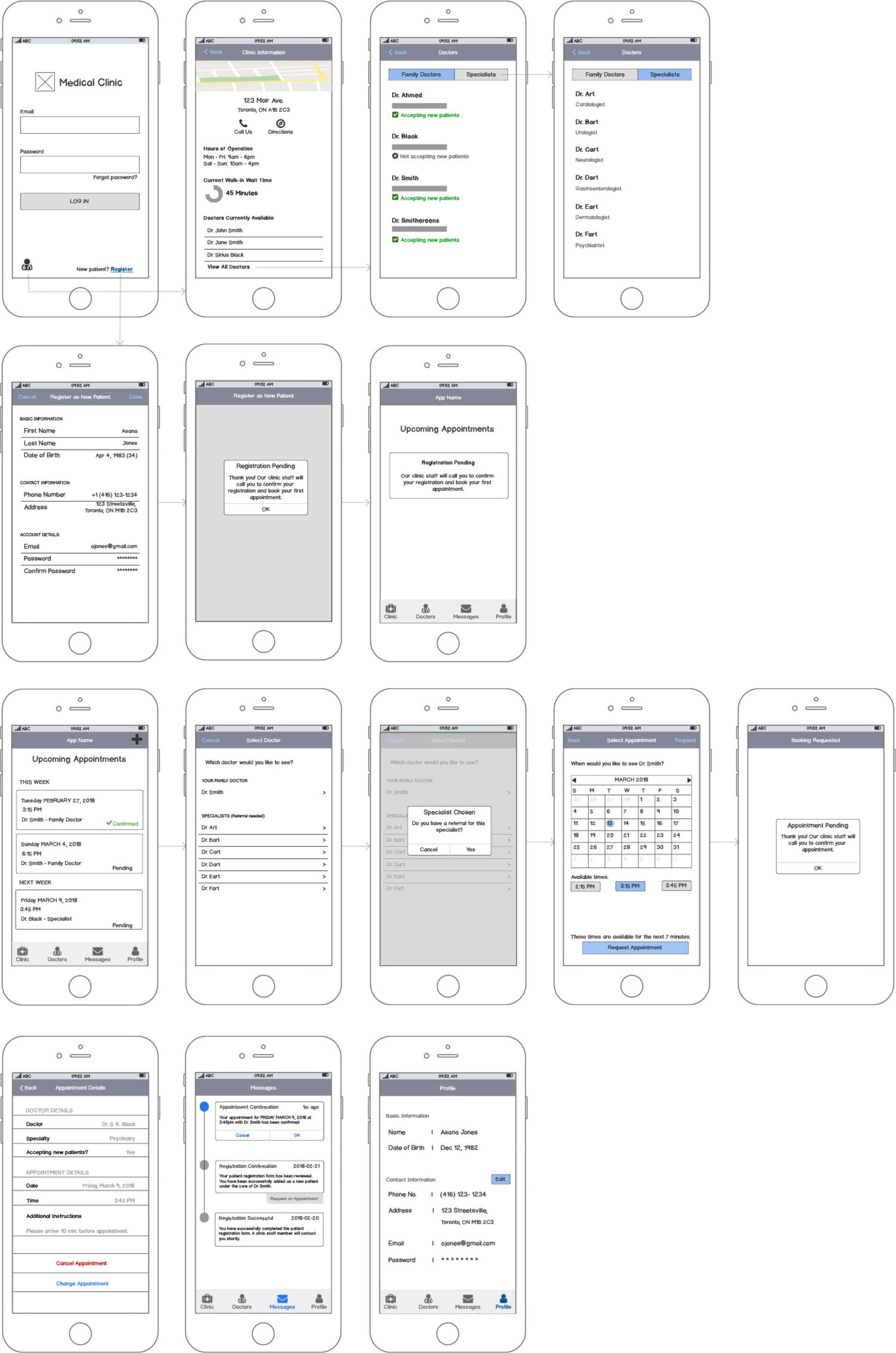
We conducted usability tests with five other target users in order to understand:
- What are users' initial and overall impressions of the app?
- Do users understand what they can do in the app?
- Can users easily register themselves, manage their appointments, and get clinic information with this app?
- Do users find the app valuable?
Based on their feedback, we made multiple iterations of our screens and took them back to our participants for further testing.
Example of iteration:
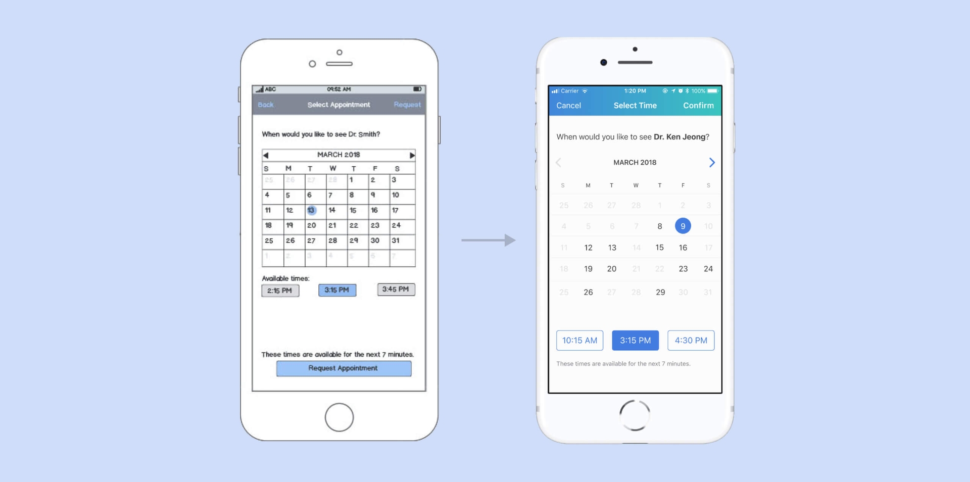
Pain Point: Users were unsure as to what dates were available when booking appointments.
Design Solution: Offer visual cues by disabling and greying out dates when doctor is unavailable.
Refining the prototype with more user feedback
We incorporated the feedback received from participants into a hi-fidelity prototype using Figma. At this stage, we directed our efforts to branding, visual design, and compliance with Apple Human Interface Guidelines for both iOS and watchOS.
Final Deliverables
After multiple rapid and iterative cycles, the following designs were deemed to best meet our target users' needs.
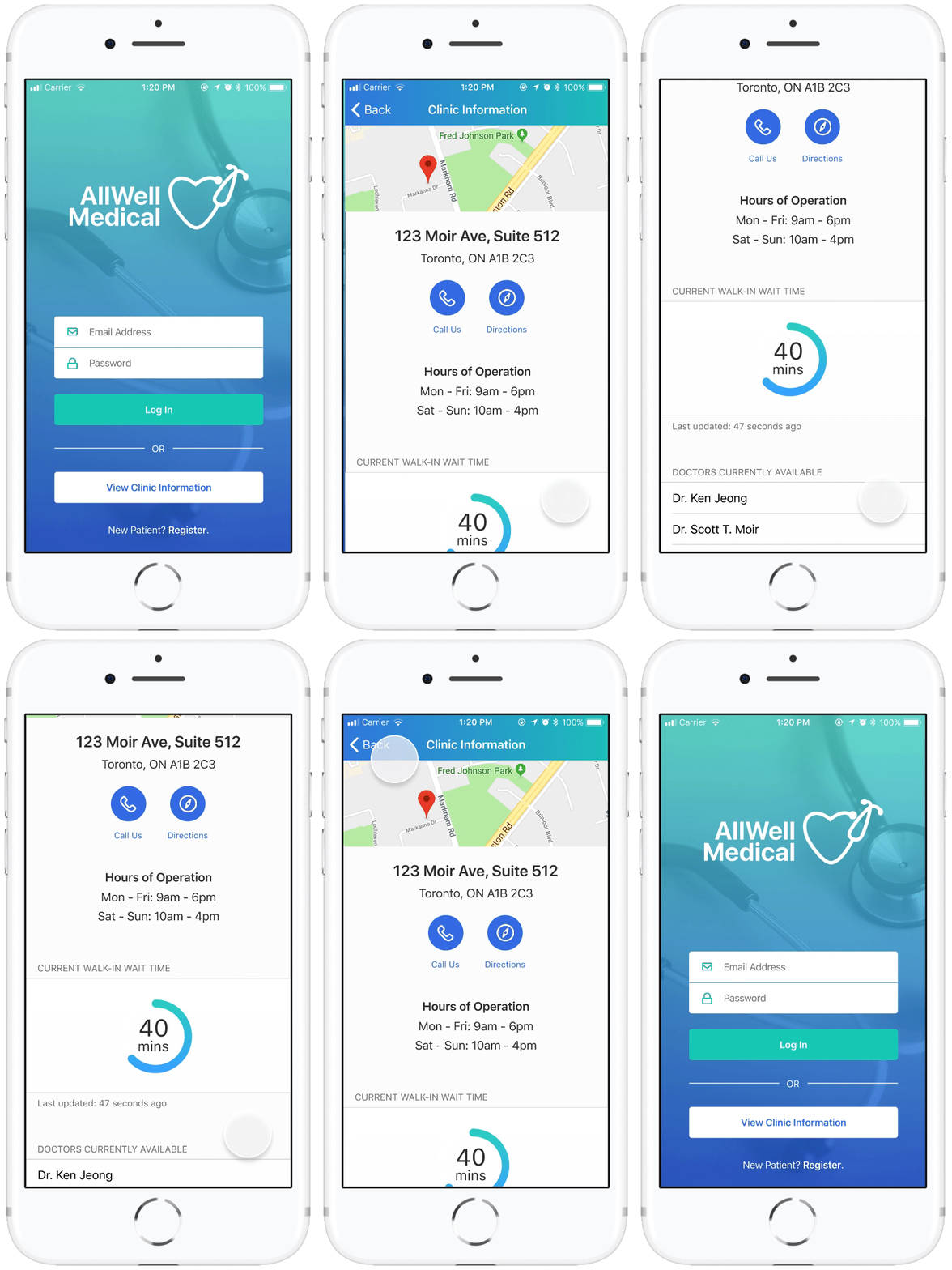
Visiting the Walk-In Clinic
The Clinic Information screen provides an overview of the current status of the clinic, including hours of operation, estimated walk-in wait time, and a list of doctors on duty.
This helps both registered and non-registered users decide whether to visit the clinic as a walk-in patient, and they can access this information from the home screen without needing to log in.
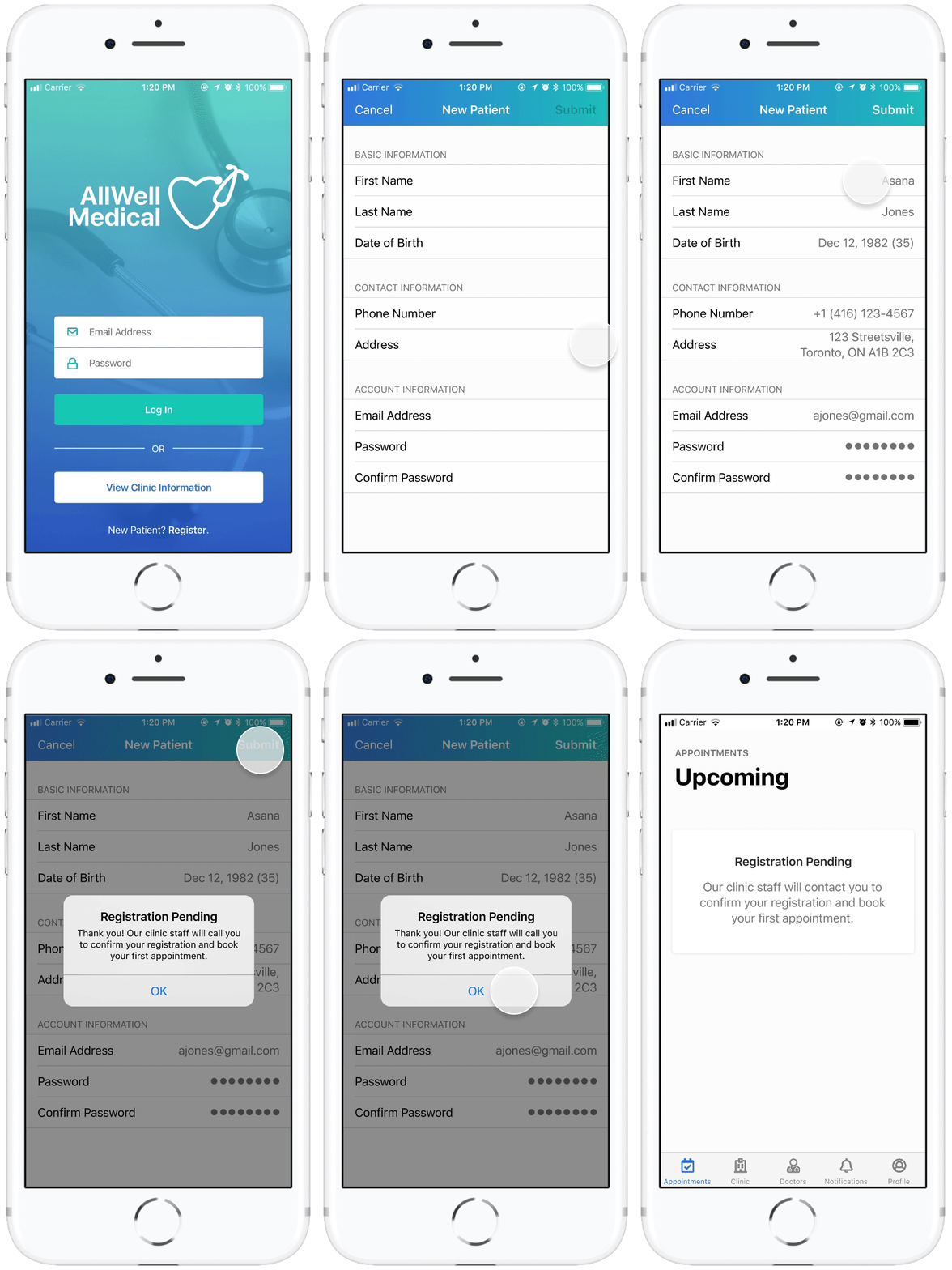
Registering as a New Patient
New patients can opt to register with the clinic by filling out the registration form on the app.
They can enter their name, contact information, and also create an account to view and manage all their appointment records in one place.
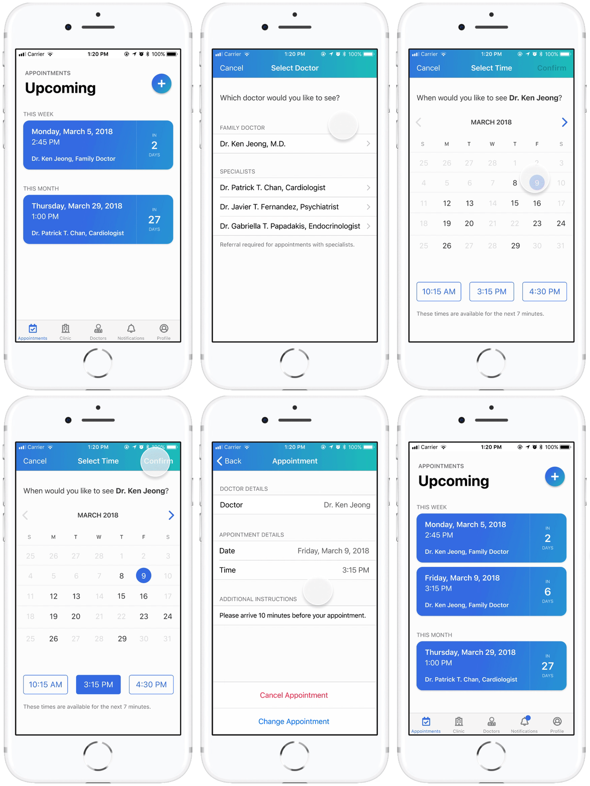
Booking and Managing Appointments
Once registered, patients can self-schedule their appointments and make changes or cancellations without waiting to speak with staff.
Patients can choose their preferred doctor, view their availability, and select a timeslot for the appointment.
Accessing Doctors' Information
The Doctors screen provides patients with key information about family doctors and specialists working at the clinic.
They can view the doctors' names, specialties, certifications, years of experience, and whether they are currently accepting new patients.

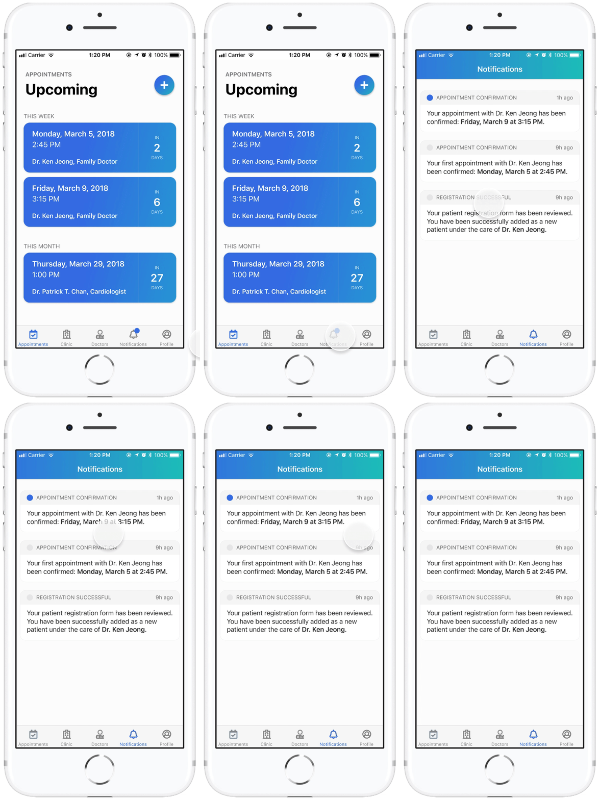
Receiving Appointment Reminders and Notifications
The Notifications screen provides patients with important status updates about their appointments (confirmations, changes, cancellations).
Patients are also notified and reminded of upcoming appointments as they draw near.
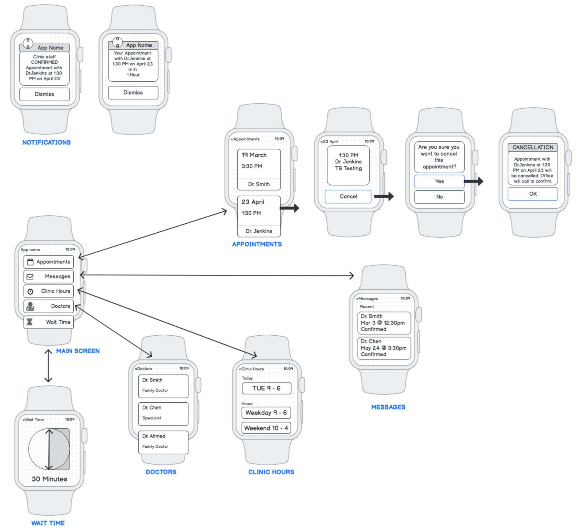
Using the Watch App
The watch interface complements the phone interface by allowing quick access to information and tasks that are relevant to users on the go.
This includes viewing upcoming appointments, receiving reminders, and checking wait times and doctors currently available for walk-in visits.

Reflections
Early feedback from users leads to better design decisions all around. Creating ongoing changes to the design based on early and continuous user testing provided us with insights into what was working and what wasn't at each stage of the design process.
Designing for a smaller screen forces you to decide what matters most. This was our first time designing a smartwatch app and it challenged us to prioritize content and features in a way that not only adhered to watchOS guidelines but also ensured a consistent experience across devices.
Lean UX is an incredibly useful technique for projects with shorter timeframes. We dug directly into building a testable prototype based on what we assumed would add value to our target users, and then went back and validated/refuted our assumptions iteratively based on how actual users perceived our designs.