Ontario College of Teachers Website
Redesigning the website to build trust and improve engagement with parents.
Overview
Working in a team of 6 UX designers, my colleagues and I were tasked with the opportunity to work directly with the Ontario College of Teachers for a design course. Our challenge was to explore different ways we could improve the overall usability and accessibility of the website, specifically for parents of school children.
My Role
- User Research
- Accessibility Audit
- User Persona
- User Testing
- HTML Prototype
- Poster Design
Timeline
- 3 months
Tools
- Figma
- HTML + CSS
- WAVE
- Optimal Workshop
Team
- Claudia Szabuniewicz
- Michael Plotnikov
- Pei Xian Chia
- Sabrina Li
- Sneha Parekh
About OCT
Ontario College of Teachers (OCT) is a regulatory body in Ontario that licenses, governs, and regulates the teaching profession in the public interest. All public school teachers and administrators in Ontario must be registrants of the College.
Problem
OCT maintains an online database of certified teachers and provides details about teacher accreditation, standards of practice, disciplinary procedures, and more through its website.
Informed by internal research efforts, OCT wanted to better highlight these services on their website in order to boost engagement with parents of school children and to build public confidence in the teaching profession.
How might we improve the OCT website to build trust and improve engagement with parents?
Goals
Our goal was to redesign the OCT website to align with its target audience's priorities and improve its overall usability and accessibility in order to support OCT's mandate of serving the public interest.
Target Users: Ontarian parents of school-aged children, who have basic technological competence and are not part of the teaching community.
Process
🤝
Empathize
- User Interviews
- Usability Testing
- Accessibility Audit
- Card Sorting
🎯
Define
- Research Synthesis
- User Persona
💡
Ideate
- Comparative Analysis
- Information Architecture
🖌
Prototype
- Low Fidelity
- High Fidelity
- HTML Prototype
🔍
Test
- Usability Testing
- Tree Testing
- A/B Testing
- First-Click Testing
User Interviews
To gain a better understanding of how we could more effectively address the needs of parents, we conducted four one-on-one semi-structured interviews with target users identified from our personal networks. This helped us to gauge the context of parents' engagement with their children's teachers and the OCT.
Sample Interview Questions:
- "How do you communicate with your children's teachers?"
- "If you have a concern about a teacher, how do you go about addressing it?"
- "What does teacher credibility mean to you?"
Key Findings:
- Parents' main priorities were related to their children's safety and growth in the classroom.
- Teachers' personal qualities and their care and enthusiasm for kids were more important to parents than their formal qualifications.
- Parents were not familiar with the OCT as the regulatory body for teachers.
Usability Testing
Next, we conducted usability tests with three parents who had no prior experience with the OCT website in order to assess its functionality and intuitiveness.
Participants were asked to complete the following tasks that were identified through our research as the main features of the website:
- Find a specific teacher's qualifications
- Submit a complaint
- Find information on teaching standards and ethics
Key Findings:
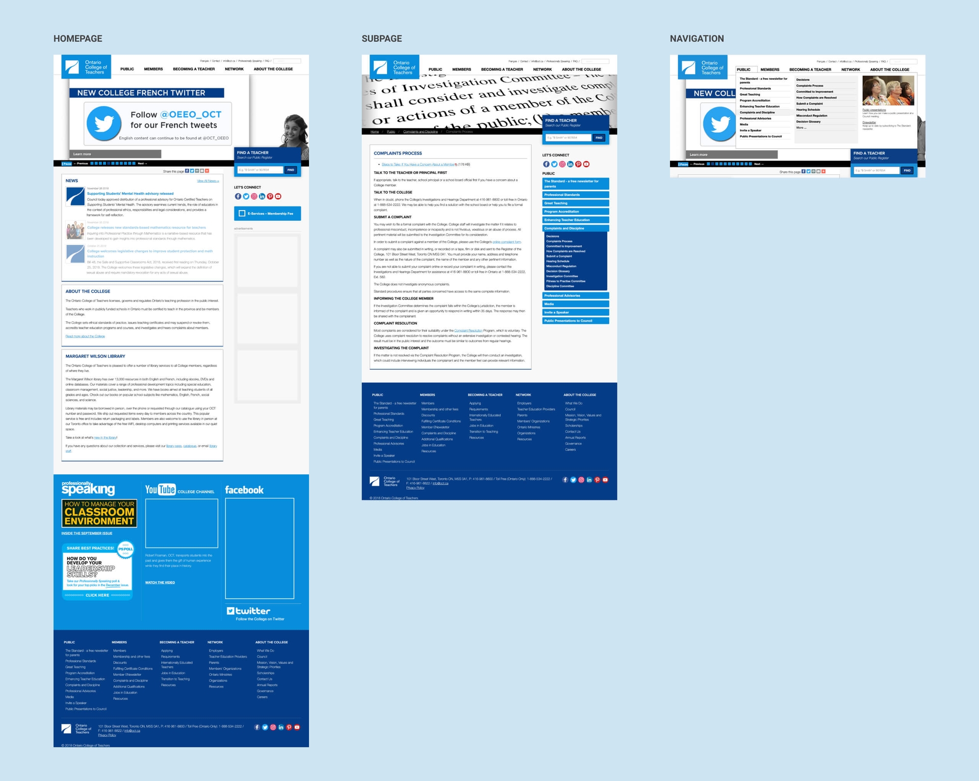
Cluttered homepage. Participants did not understand the purpose of the website from the homepage and complained about "too much text". They also expressed doubts regarding the credibility of the website due to multiple social media ads and banners.
Complicated information architecture. Participants were frustrated with the website navigation, which included three layers of links nested deeply within dropdown menus. They did not notice the secondary navigation or breadcrumbs in the subpages.
Low findability and discoverability. Participants felt the information on the website was irrelevant to them and had difficulty completing the tasks. For example, participants missed the "Find a Teacher" feature despite it being on the homepage.
Accessibility Audit
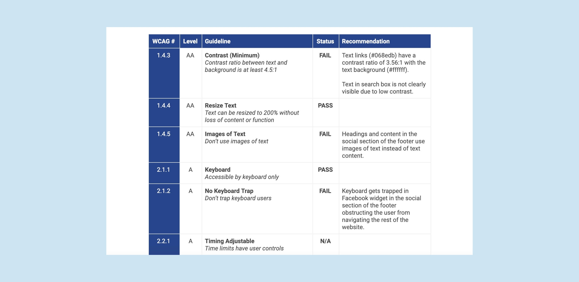
We also conducted an accessibility audit of the website using a combination of semi-automated and manual evaluation tools such as WAVE, colour contrast checkers, and screen readers.
The audit revealed that the website did not comply with WCAG 2.0 Level AA guidelines — the most prominent issues being low colour contrast in text and poor alt text for informative images.
These issues, along with recommended fixes, were compiled into a report and delivered to the client.
Research Synthesis
After analyzing all insights gleaned from our user research, we defined the following objectives for the redesign:
1.
Communicate key messages that are relevant to parents clearly and concisely.
2.
Improve information architecture to make important content more findable and discoverable.
3.
Follow WCAG 2.0 Level AA accessibility standards to comply with AODA (Accessibility for Ontarians with Disabilities Act).
User Persona
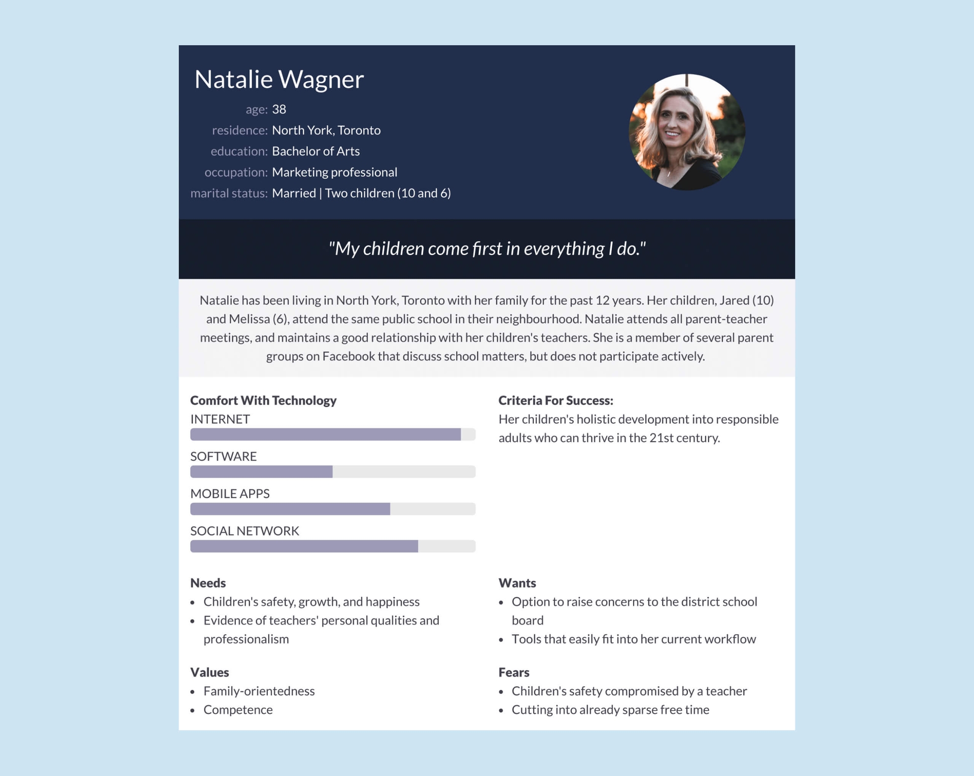
Using the interview data, we constructed a user persona, Natalie, to map the goals, motivations, and frustrations of parents, which guided us through the redesign process.
Natalie is actively involved in her children's education and wants easy access to information about their teachers' personal and professional qualifications.
Comparative Analysis
To gain inspiration and identify best practices for the redesign, we began by looking at landing pages of similar regulatory bodies in Ontario with a specific focus on their information structure and layout.

One common feature we identified across these websites was the placement of call-to-action buttons right below the banner, emphasizing the main features of the website. This was an important design pattern to consider in order to make it easier and more efficient for users to access key information.
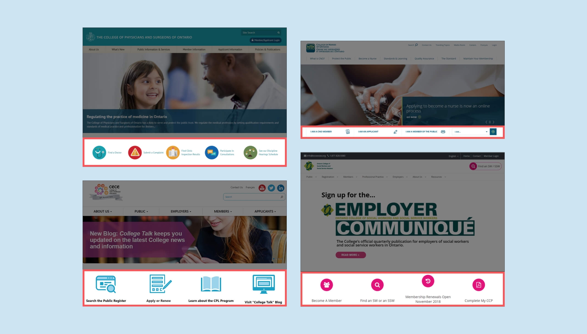
Another pattern we observed was that organizations displayed their mission statement clearly on their homepage. This effectively communicated their mandate and helped users better understand what the organization did. The 'Find a [professional]' feature was also prominent, which allowed users to easily look up information about specific individuals.
Information Architecture
After reviewing the website structures of similar organizations, we conducted six open card sorts with parents and members of the public to understand users' perception of the information space. The card sorting was conducted remotely using OptimalSort and it informed the following information schematic:
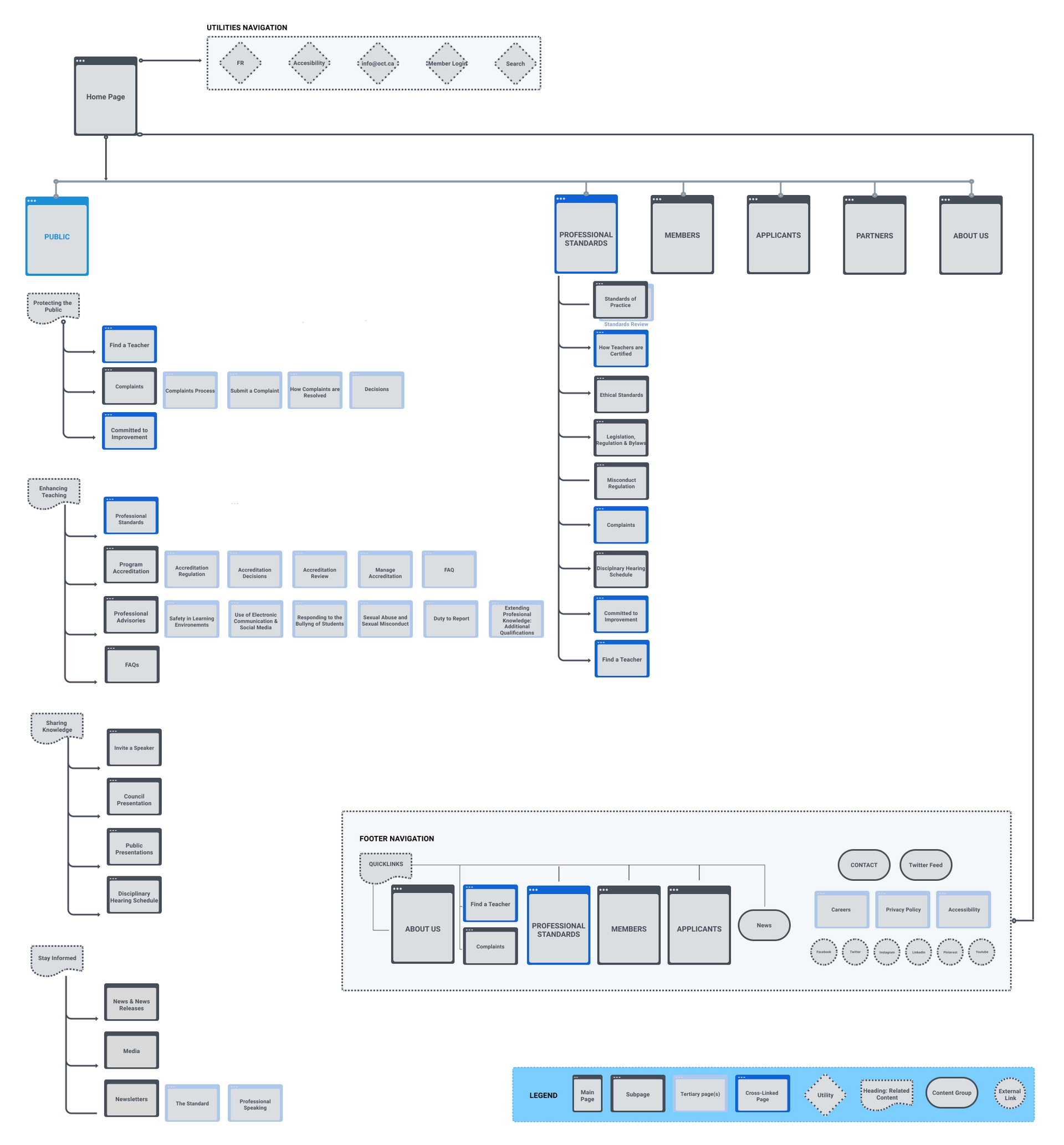
To validate the assumptions made in the grouping of content, we conducted a tree test administered remotely via Treejack with 10 participants. Based on the results, certain links were relabeled or cross-linked under different sections to reinforce user expectations and mental models.
For example, removing the 'Discipline' category from 'Public' as users did not find content under this heading to be relevant to their needs, and changing the label 'Employers' to 'Partners' to better reflect the audiences served.
Design and Testing
Once we had a good idea about the website structure, we brainstormed ideas for the layout on paper and then moved on to creating wireframes.
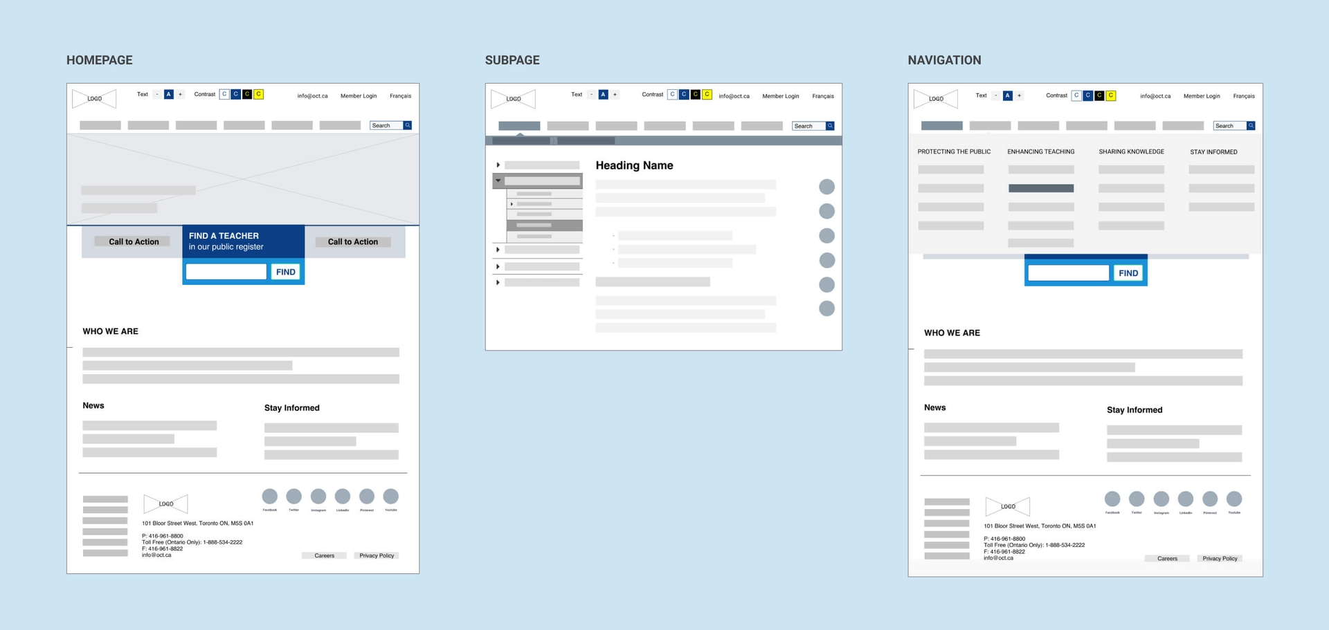
We took an iterative testing approach to progress the design of the website to the final HTML prototype stage. The designs were tested, iterated, and validated using a combination of A/B, first-click, and usability testing methods.
Homepage
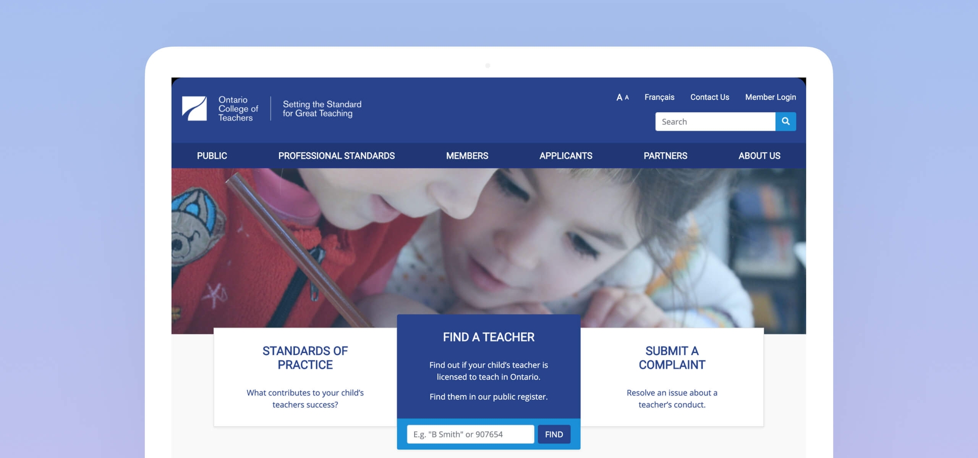
To showcase the organization's core offerings in a way that appealed to parents, we carefully curated the content on the home page.
We incorporated the organization's brand colours in the website header for a more professional look and chose an eye-catching hero banner that appealed to user's emotions. We also removed the ads, reduced the preponderance of social media links, and improved the efficiency of finding information with a list of 'Quick Links' in the footer.
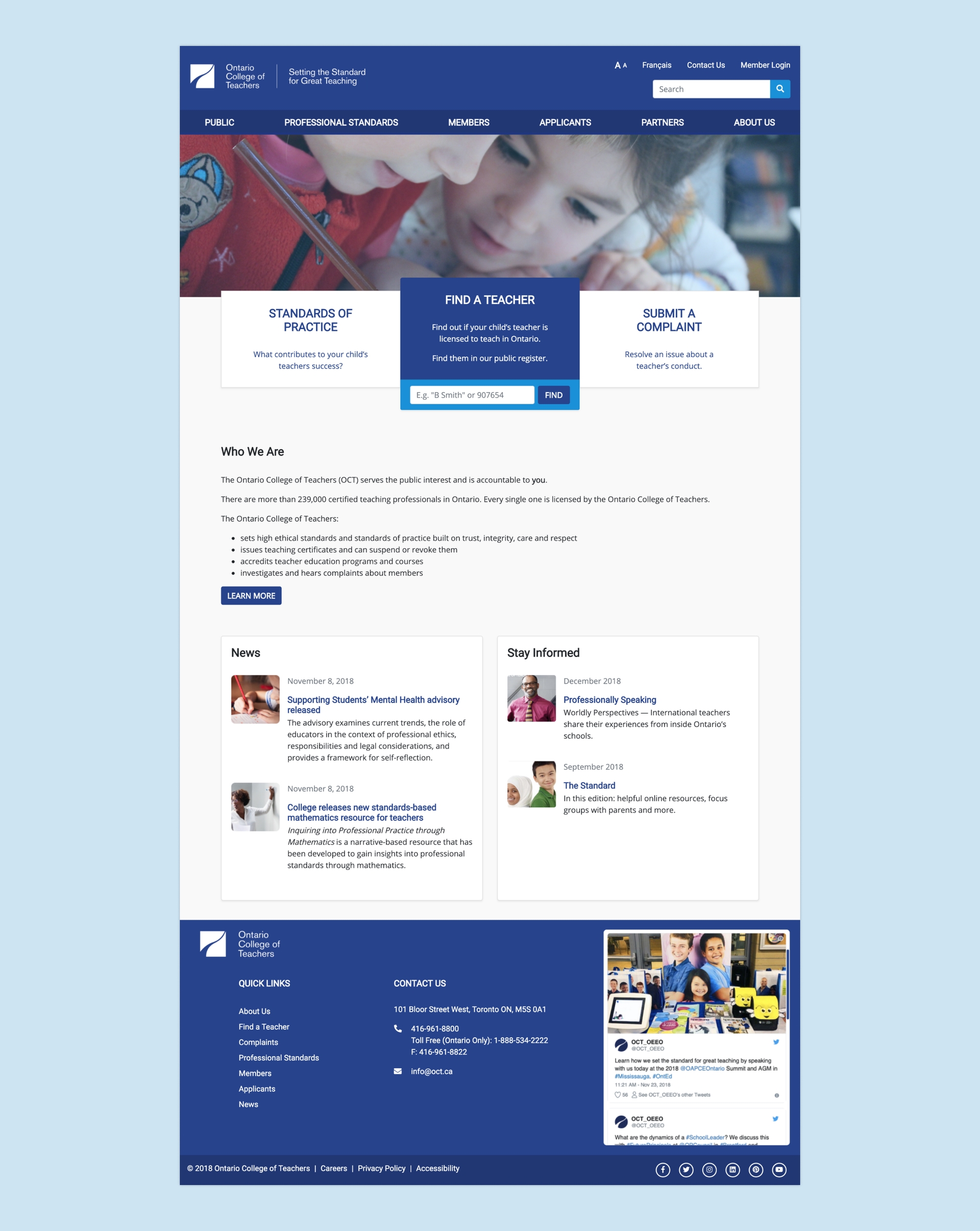
Outcome: Users liked the blue and white colour scheme, noting its simplicity and minimalist aesthetic. One user noted that the layout of the homepage was 'sleek' and gave way for a 'clean and professional' feel.
Next, we added calls-to-action outlining the three offerings that aligned with parents' priorities, the highlighted tab being 'Find a Teacher' because of its popularity.
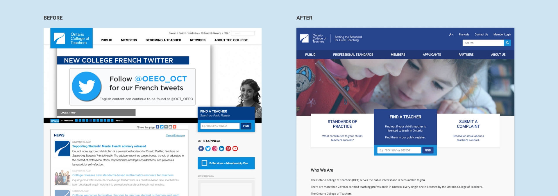
Outcome: There was a 100% task success rate of locating the 'Find a Teacher' feature after the redesign. Users reported being able to determine the purpose of the website quickly because of the centrality of the 'Find a Teacher', 'Submit a Complaint', and 'Standards of Practice' features.
"I really like the 'Find A Teacher' function and that it stands out on the page."
We also highlighted OCT's mandate with a short introduction on the homepage to provide users with context about the organization.
Outcome: Users were able to clearly determine the College's purpose from the homepage, and one user reported that the website gave the impression that it was targeted specifically towards parents.
Navigation
For the global navigation, we decided to incorporate a mega menu. We eliminated the third layer of navigation in the new design to increase mobile-friendliness and reduce the number of clicks it takes to find information.

Outcome: The mega menu was reported to be very effective by users, particularly with the inclusion of descriptive labels to group related content into distinct sub-categories (e.g. Protecting the Public).
"The menu is very straightforward and tells me what each heading is, and I can understand what would show up if I clicked it."
Subpages
For the secondary navigation in the subpages, we relocated the side menu from the right to the left to increase its visibility. User testing showed a preference for local navigation on the left-hand side, which provided a clear overview of relevant content, consistent with existing F-pattern reports of eye-tracking research.
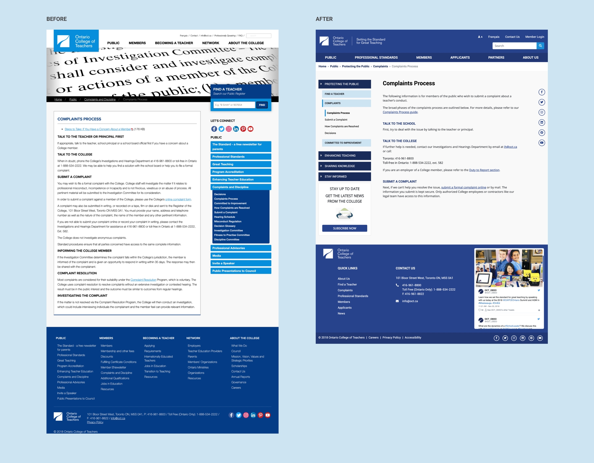
Outcome: Users found that the organization of the menu links was intuitive, and they were able to navigate using the menus to finish their assigned tasks without issue.
Final Deliverables
After validating the designs, we created an HTML prototype demonstrating the desktop experience. View prototype →
We also put together a poster outlining all of our research methods, key insights, and recommendations for the client. View poster →
"I was so impressed by the rigour and depth of your analysis, your solutions, your insight... the whole package. Thank you so much!"
Mark Farmer, Senior Digital Media Strategist at OCT
Reflections
User personas give a solid defence against scope creep. Given the numerous possibilities of how we could redesign the website, having Natalie, our persona, at the forefront of all design decisions helped to define the scope and manage expectations.
Maintaining regular communication with stakeholders helps create a shared vision for success. We had an open communication channel with our client representative which really helped ensure we were on the same page at every step of the design process.
Ensuring accessibility from the outset is better than retrofitting it. We developed a UI style guide following accessibility guidelines which made it easier for us to attain cohesiveness in our final designs at the later stages.